Insight
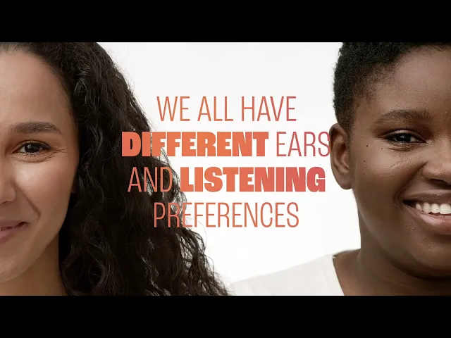
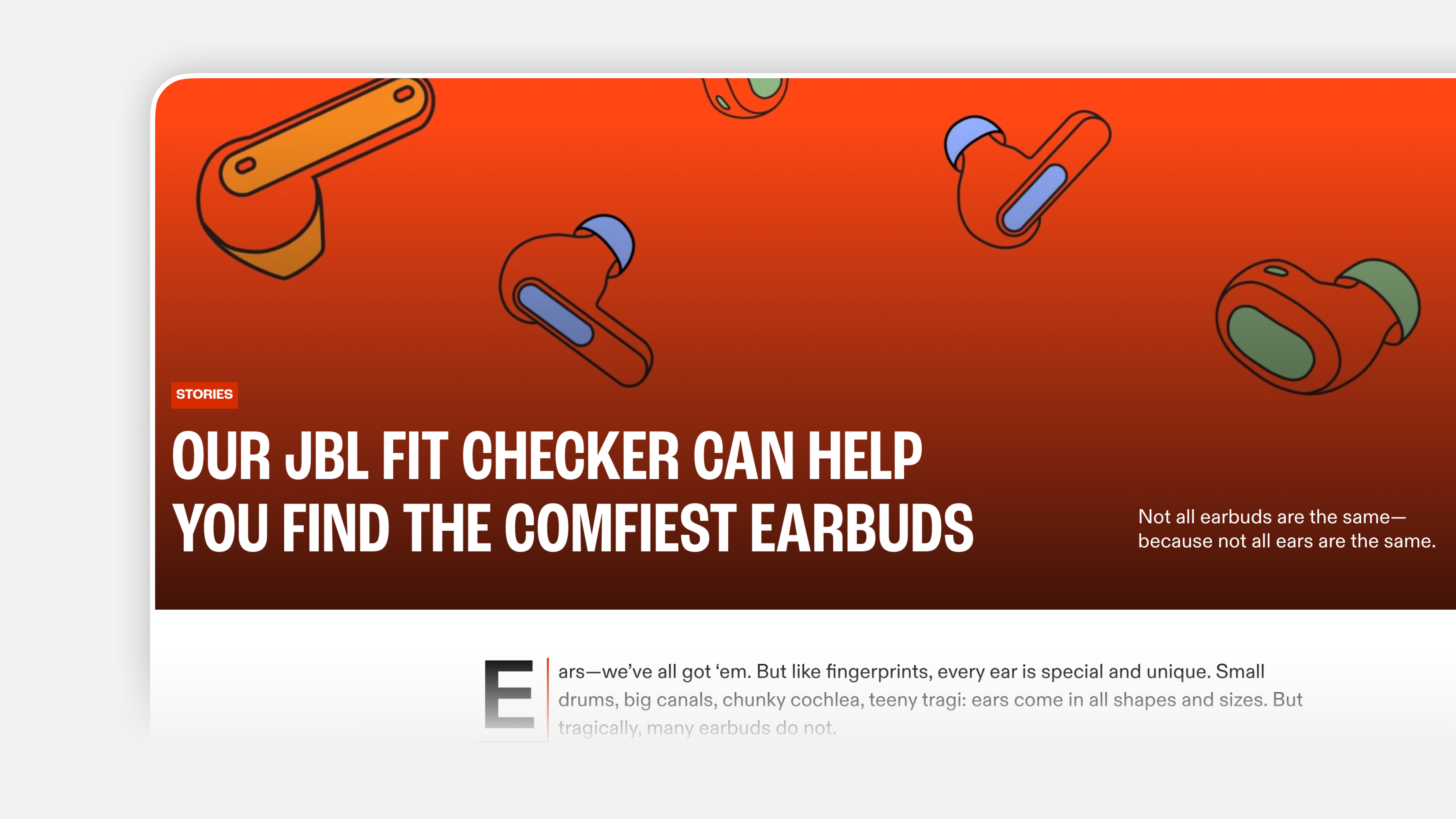
Finding the right fit depends on both physical ear structure and individual listening preferences. Existing solutions either hide the logic behind opaque systems or overwhelm users with technical detail. A successful experience is needed to make advanced sensing technology feel intuitive, guided, and trustworthy.
User Journey
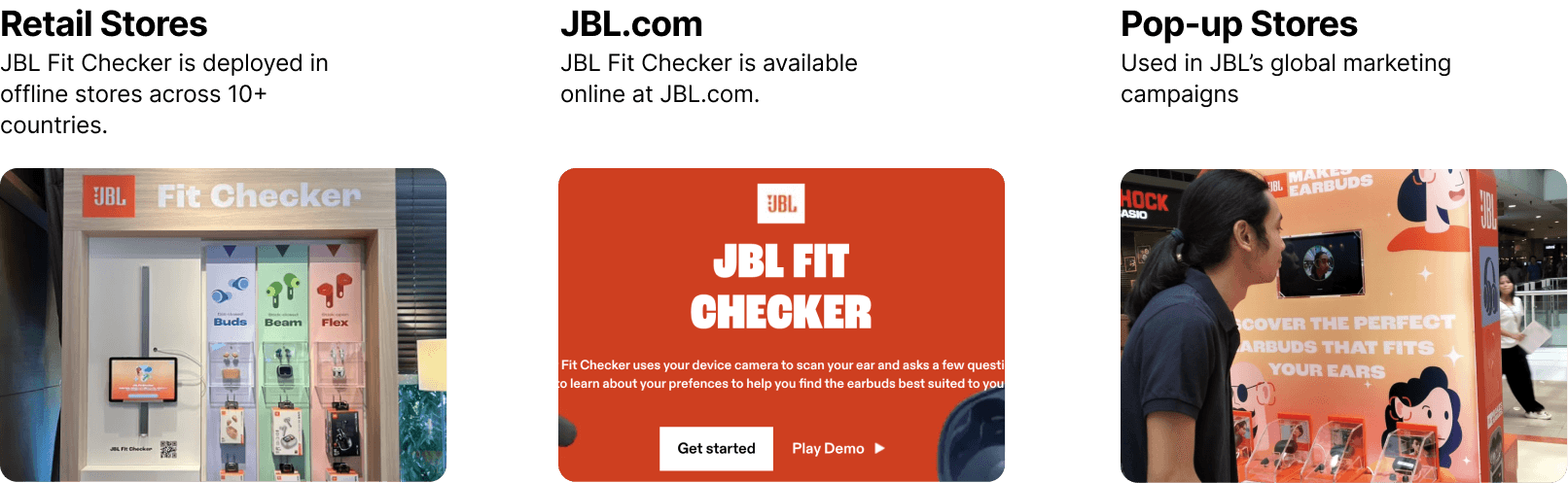
We illustrated a storyboard that maps the end-to-end user journey of JBL Fit Checker across both in-store and online contexts. After scanning both ears, users answer a small set of preference questions related to comfort and listening habits. The system then presents a clear fit recommendation, helping users quickly understand which earbud type suits them best and supporting confident purchase decisions. The same core flow adapts to assisted retail scenarios and independent at-home use.
Bench-marking
We studied existing audio personalization and scanning experiences, including Apple Spatial Audio, Sony Headphones Connect, Creative Super X-Fi, and QQ Music. From this analysis, we identified the need for a more guided, accessible, and transparent experience, one that communicates system feedback through motion, sound, and instructional UI rather than technical language.
Onboarding
The experience begins with a lightweight onboarding flow that clearly introduces the scanning process and sets expectations.

Camera permissions and the End-User License Agreement are presented upfront to establish transparency around data usage. This early clarity helps build trust before any biometric interaction begins, reducing hesitation and drop-off during scanning.
Motion-Guided Scanning
To ensure accurate ear capture, the scanning process relies on motion-guided visual feedback. Animated indicators help users position their head correctly and understand when the system is actively scanning.

Motion is used as functional feedback rather than decoration, reducing ambiguity and allowing users to complete the scan confidently without verbal instruction.
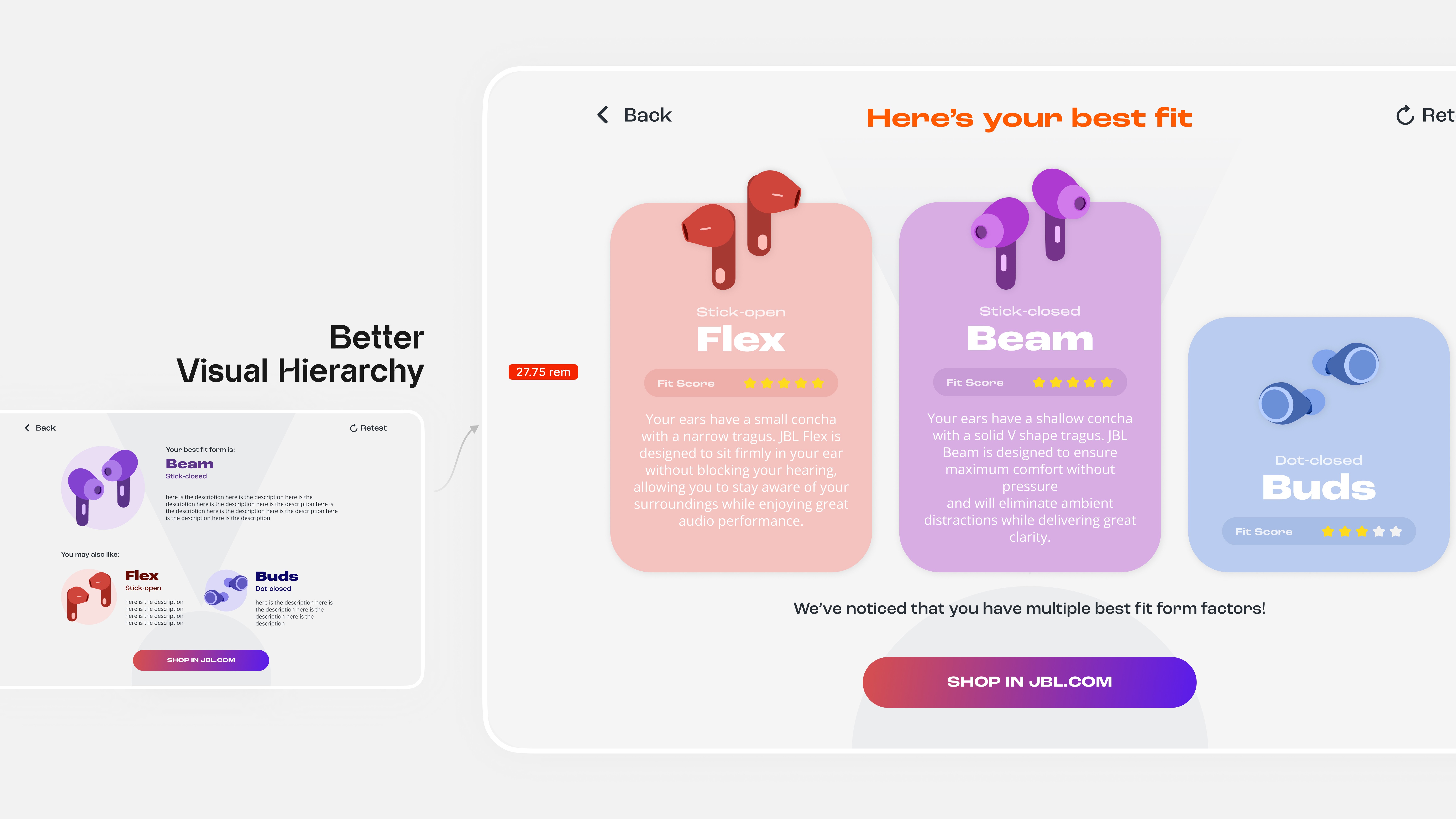
Result Presentation and Fit Score Visualization
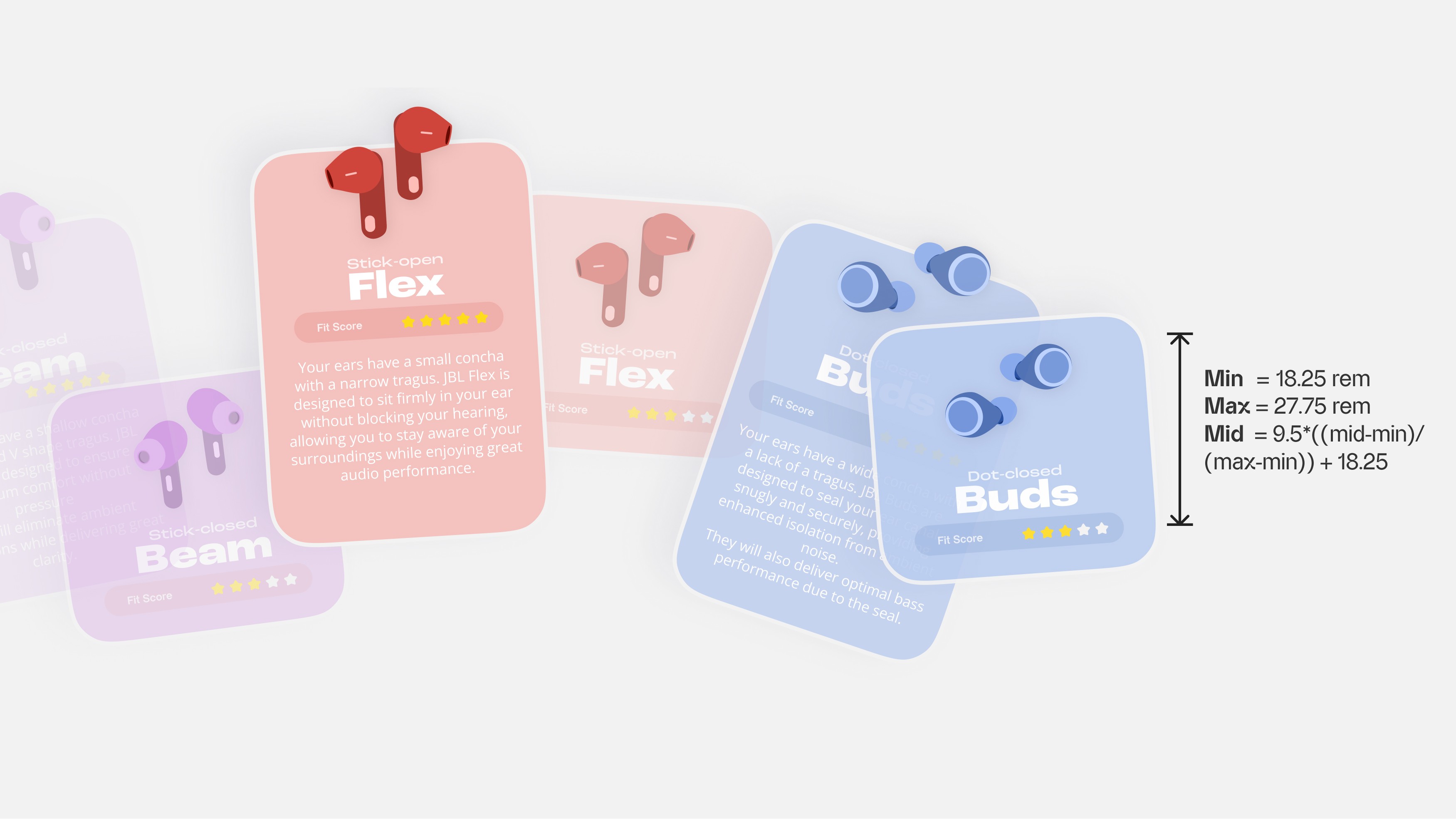
The result page is designed to make fit recommendations easy to understand and compare. We introduced a user-facing fit score that translates machine learning output into a star-based rating system.
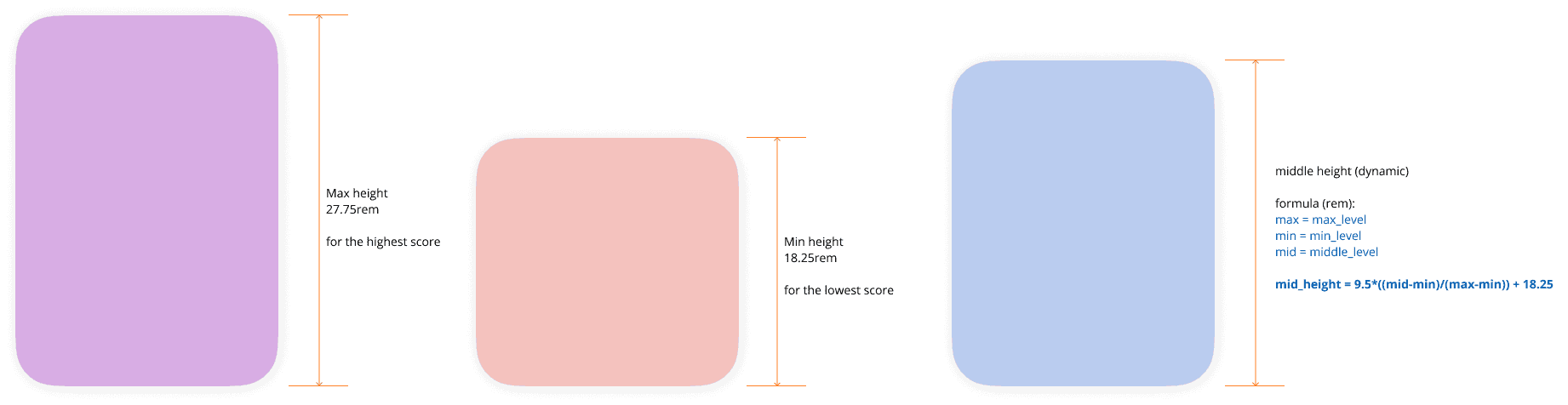
To improve clarity, the visual height of each recommendation card is dynamically linked to its fit score. Higher scores appear taller, while lower scores appear shorter, enabling immediate visual comparison at a glance.
This approach also increases transparency when results vary slightly across multiple scans. Differences in score are reflected consistently in the layout, helping users perceive variation as meaningful rather than random.
Card Layout Logic
Card positioning follows a consistent reference order while prioritizing the highest-scoring option in the center. When scores are equal or nearly equal, the layout defaults to a stable, predictable order to avoid unnecessary visual emphasis.
Protected Content
Design Deck
Protected Content
Enter the password to view